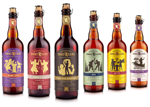
Brewery Ommegang’s old look left much to be desired. On the shelf they didn’t really stand out and at first glance the consumer could be hard pressed to tell if their offerings were in fact from the same brewer. Fortunately, it is 2012 and beer brands seem to be getting new looks a lot more often.


Designed by Duffy & Partners Ommegang’s new look has a lot going for it. First off, while the old labels were very Belgian, they lacked a certain cohesion. There was nothing signifying them as products from the same company. The new look certainly captures Belgian elements and can probably be described as modern Belgian. The look of the Ommegang name has been updated as well, and features a more robust and commanding appeal. Moving from a sans-serif, to a sans-serif blackletter hybrid the design just feels more appropriate.
![]()
The Ommegang lion has been given a facelift as well. Previously, the lion had a more illustrative feel, while the new feels more contemporary and symbolic. With the addition of the plaid coloring within the lion, the packaging is complete.

My favorite part of the Ommegang re-branding has to be the silhouettes that adorn each of the individual beer labels. They lend movement and character, and again provide cohesion and continuity. Both important marketing weapons in an ever-growing craft beer market where brands must stand out both in taste and in style.
